Saturday 13 December 2014

Influence

The first project of third year was to do with our influences and inspirations.

The brief was to come up with a design that could be used on half an A1 Poster in collaboration with students from Shanghai Institute of Visual Arts.

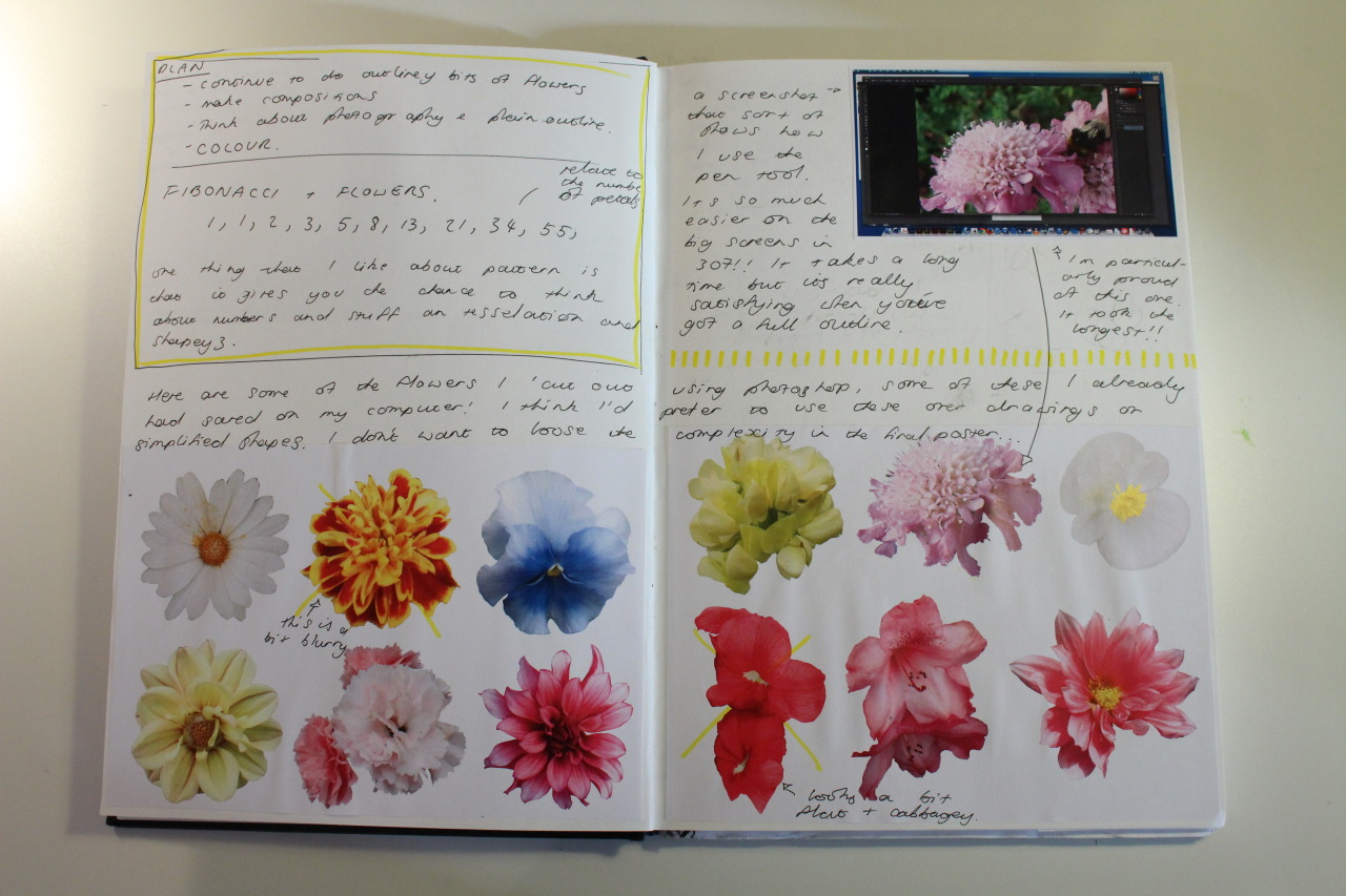
I like flowers, I always have. I like the natural forms, the tonal and contrasting colours, and the sheer variety of different species. When I’m drawing anything for a project I always tend to warm up by doodling flowers from memory or from photographs.

I also like pattern and shape. Most of my inspiration for visuals in my projects comes from pattern design and I have a few books on the subject that I enjoy having a look through on a regular basis.

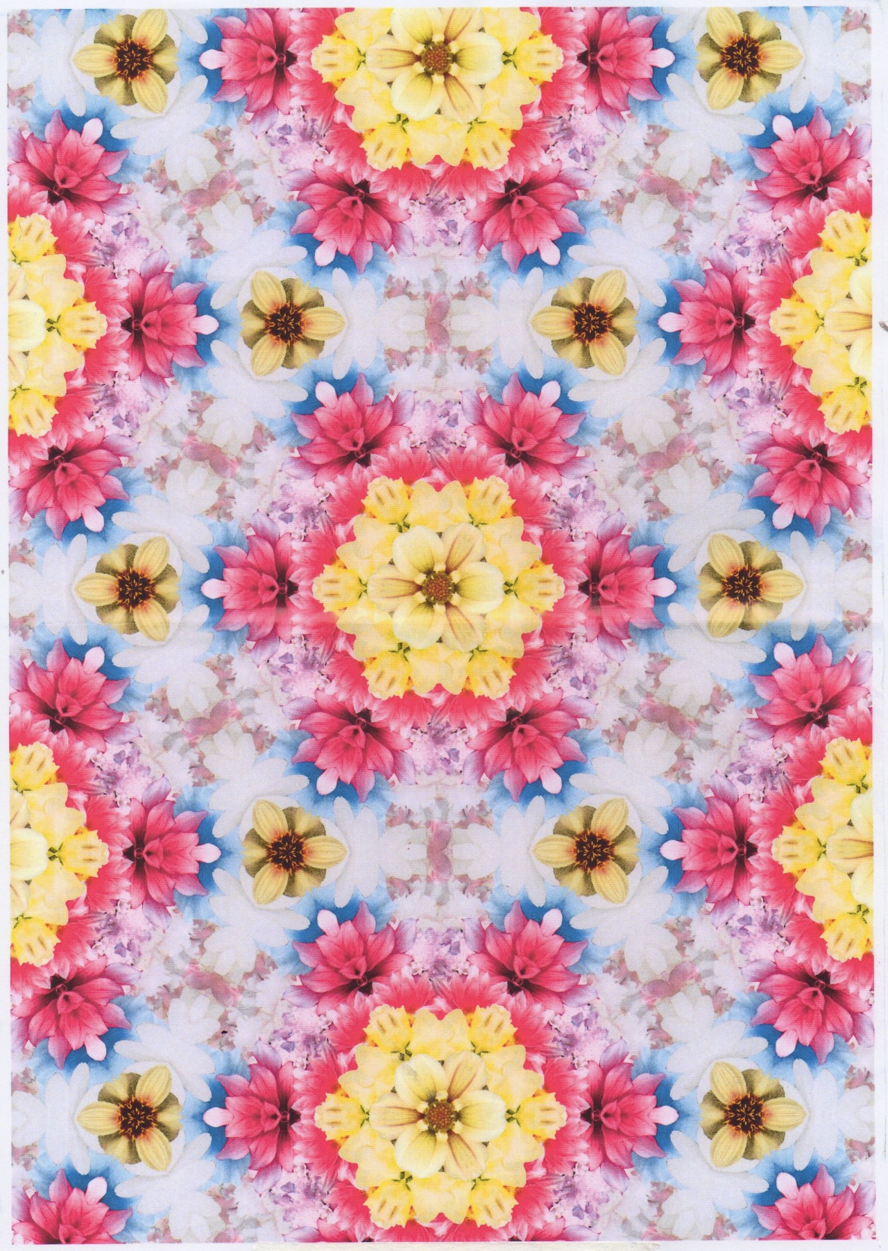
So I made a floral pattern!


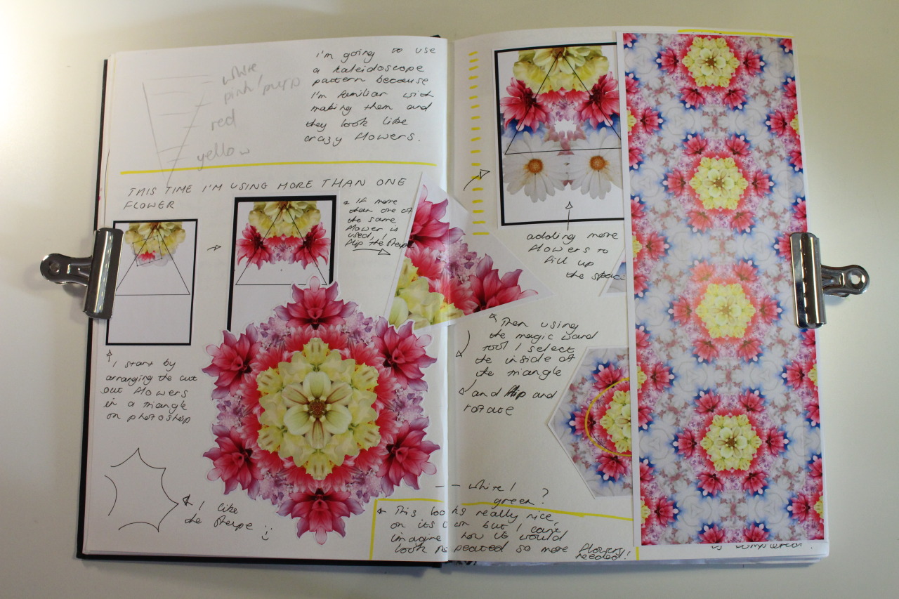
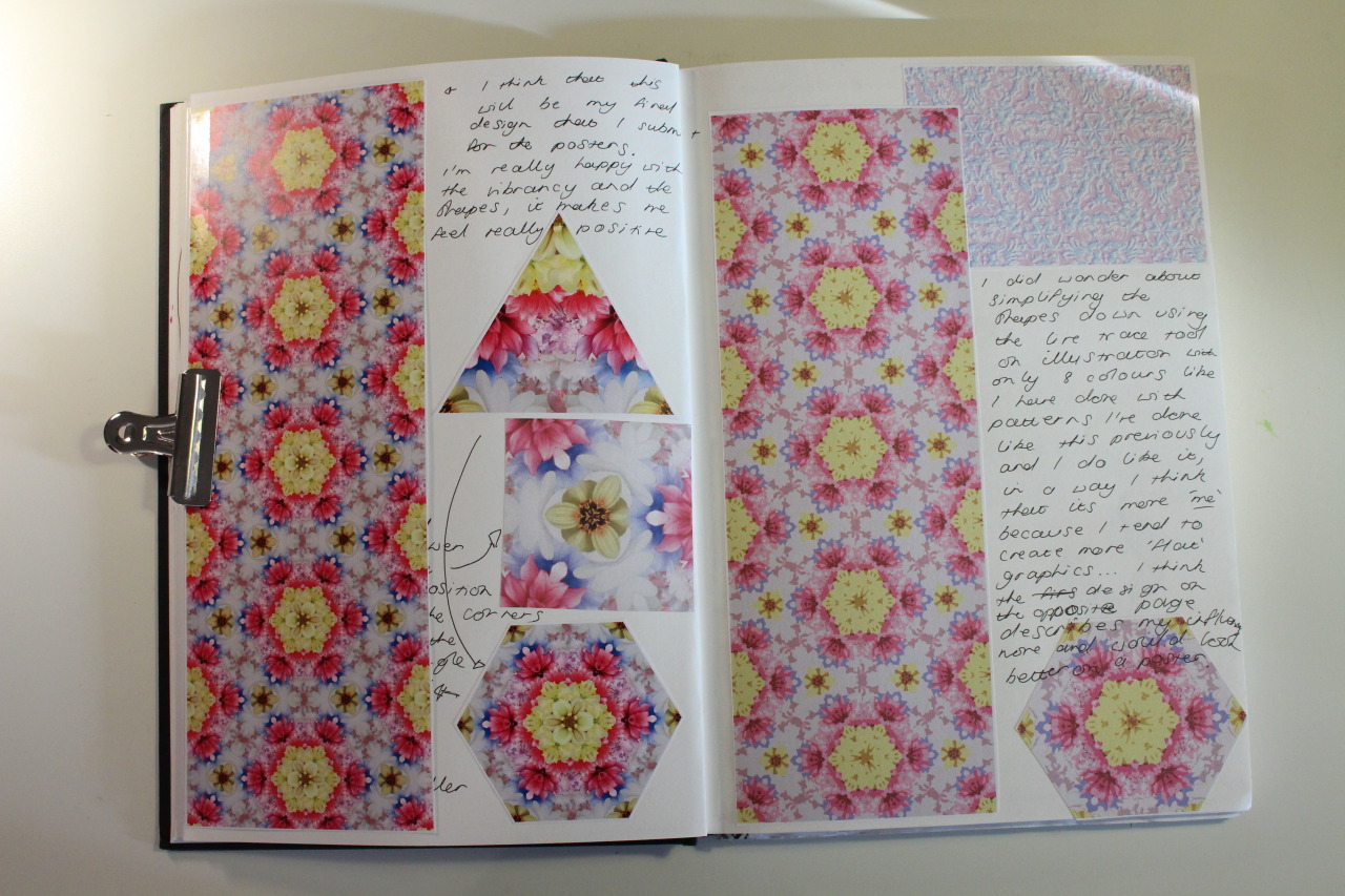
The pattern technique was one that I'd used previously, involving creating a composition within a triangle and then flipping and rotating that shape to form a hexagon, which is then repeated.

We also got to use the big fancy printer. v. exciting (the pattern on the left is Becky Riley's - good isn't it).


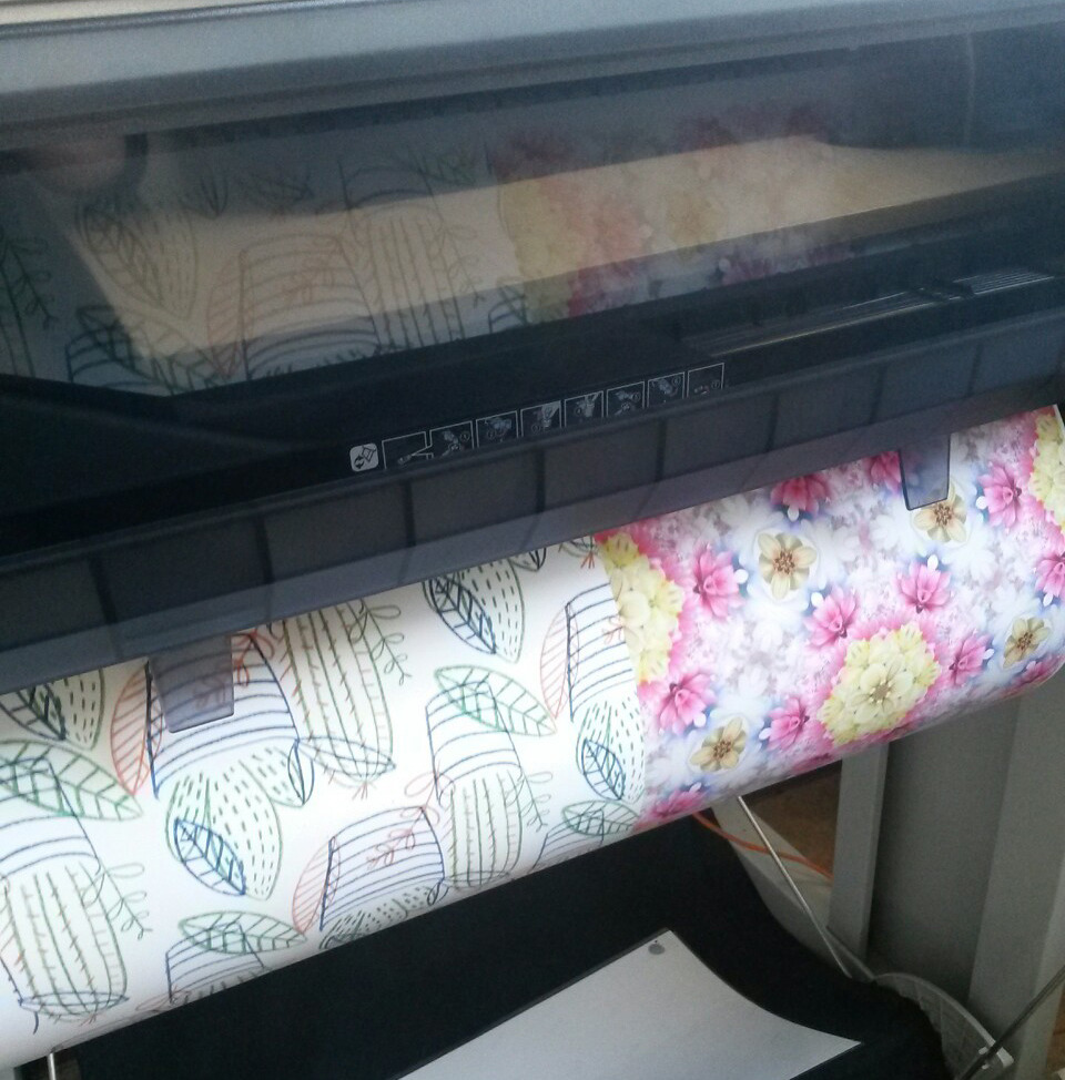
Unfortunately due to a hard drive melt down :-----( I don't have the original file - but I do have this scan of a print out which gets the point across.


I'm really happy with this project, it was nice to work quickly on something as we had less than a week to spend on the project

A good start to third year I'd say. 

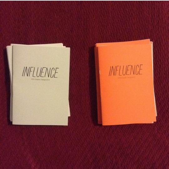
P.S. I made sort of zine things!

After seeing everyones work on the presentation day I thought what a shame it would be if the work that hadn't been selected didn't get used anywhere. So I asked the people who wanted to get involved to send their work to be compiled into two editions of a zine that we could sell at this years Nottingham Zine Fair to get fundraising started! (Becky helped a lot with this)


If you would like to find out more about my course's fundraising events please go to

 facebook.com/ntuandcollective

We have cool jumpers, t-shirts and other merch and we put on really great club nights in Nottingham.

Friday 12 December 2014

Catch up & connex

Long time no blog.

My pals and I were having a chat about what we had in terms of online portfolios etc. (I have a cargo by the way cargocollective.com/laurajanewalsh) and I realised how much I miss blogging stuff that I’m doing - both in and out of university.

So lets pick up a bit after where we left off.

The last project was of second year was a live brief set by Interbrand to do with branding a new-to-the-uk telecommunications brand called connex, culminating with pitching our projects at their swanky London studio.

I started thinking about how I can show communication, pieces of information being passed from one point to another. I came across this video of Nanex’s Stock Trading Model.


This led me to think about how I could show connection visually, working with the idea of connecting the points of different shapes in different ways.


I ended up with a 12 sided shape, inspired by the Nanex model, filled with shapes of different hues of green in low opacities 


These shapes were used across the rest of the brands visual language, including posters, packaging, iconography and shop signage.


I was really pleased with the project, I still am. It was a really good way to finish of second year and further proved to me that branding is what I like to do best.

Tuesday 15 April 2014

Global Citizen: Accueil!

Entry for MPA Roses Student Awards 2014.

I chose to undertake the Global Citizen brief, with the aim of inspiring monolingual young adults to commit to learning a second language.

"Accueil!" is a smartphone app which can be used to practice reading, writing and understanding French. The concept behind the app was that young people spend lots of time on their phone everyday, talking to friends, reading magazine or newspaper articles, listening to music and watching videos. "Accueil!" offers a platform for its users to do what they're already doing on their phones, in another language which would hopefully take the hassle out of the learning process!


When I was researching, I found a statistic that people were more likely to continue to learn a language if they were learning with another person.

“Accueil!” offers the user to connect with other users to talk about what they’ve read, watched or listened to. Either through an instant messaging application which helps the user to practice writing in French, or through a ‘phone call’ with another user which allows them to practice their speaking.
The user can also keep a log of their recent contacts, meaning that users can build up friendships with one another by talking to each other about common interests.

I chose to keep things simple visually sticking to a red, white and blue colour scheme, with headlines in a hand rendered font made inspired by cut-out paper with simple icons with the hope that the user would understand what they were doing - despite the language barrier!


Tuesday 21 January 2014

Screen Printing

I did a screen printing workshop on Monday, it was reeeaaallly fun and I can't wait to do some more.


The workshop was based around practicing doing prints with more than one layer, so I started by doing a simple sketch that would work easily as a print.


I then scanned it into Photoshop and Illustrator to make it look a bit cleaner and start thinking about the image in terms of layers. Then I printed out the line-y layer and made it look a bit scruffier again. It was different (in a good way) to look at images in terms of layers of colour.

Physically printing the images was a really interesting process. Its really satisfying when everything lines up properly, although sometimes the prints look equally nice when they don't.


Me being me, I did approximately 500 billion prints on different types of paper, but I think white and grey papers work the best.


I also printed on a notebook! V fancy.

I was thinking that it might be interesting to go back and do some more of these with the hope of possibly selling them? If anyone was interested...

Friday 31 May 2013

First year


I handed in all of my work from the year yesterday!

It doesn't look like very much when it's all packed up.

I am really really looking forward to second year now, over the next few months I want to carry on making, drawing and learning how to do things so that when September comes I will be READY.

Thank you if you have read my blog, I am going to try and keep it updated over summer.

Tuesday 21 May 2013

Animation: Finished!

*drumroll*


Here it is! The product of many hours of work (about a day of filming and probably around a day in editing, other people have more precise figures but we didn't think about that!) all for a stop frame animation thats under a minute long.

From the brief, we chose the title "We Were Lost in Thoughts" and wanted to create an animation about the things that we think about that can sometimes become a bit overwhelming. Including Duncan from Blue.

Its been a v good project. I've really really enjoyed working with Ailsa, Becky and Laura (and Hannah!) I am looking forward to collaborating with them on many more projects with them in the future.

As I mentioned in a previous post, I've got a tumblr for the animation project which I'll try and update a little bit more, so if you would like any more information about inspirations or the process that we went through then have a look at laurajanewalshanimation.tumblr.com.

Sunday 12 May 2013

The Wind in the Willows: Book Cover

I've finished that essay, so here is the post with my submission to the Penguin Design Award for the Puffin Children's prize. I didn't get shortlisted which I'm not surprised about because the shortlisted entries for both prizes are AMAZING but I might as well put it up here.


As I mentioned in my last post, I  was thinking about paper cutting so set about planning something relatively simple that I would be able to complete.


I then set about cutting some nice bits o' green paper with the intention of layering them over each other. (There is a MASSIVE error in one of the cuttings which is very humiliating, I'm sure you'll be able to spot it - that's just the result of late night paper cutting when you are a bit like this).


The effect isn't too bad, but the text is a little messy, so I scanned the paper cuttings into the computer and had a bit of a fiddle on Illustrator (which I am beginning to be able to use without crying) with changing the colours and neatening things up and this was the result...

Another mistake on the blurb here, no excuses for that other than I should have proof read it one final time (I will learn).

I'm not sure how I feel about the final outcome. I like the colours, I wanted to represent the changing in the seasons and the contrast between the happy bits during the day and the sadder, more scary bits at night time. But overall - could do better.

I think I got a bit stressed out about this project, I'm happy that I experimented with paper cutting but I don't think that comes across in the final cover. Also I'm not really sure if it looks like a Willow tree, possibly more The Wind in the Jungle?

Oh well, I'll try again next year!